
Build Reusable Components with Vue.js (Part 1: Tab component)
Sometimes when working on a project, I’m always faced with the task of having to build a complex reusable component. I know some may say why don’t you just install something like Material UI or Chakra UI but I must say that doesn’t work all the time. Most especially when your designer has a special treat for you 😩. And it’s really unnecessary when all you need from such a library is just a component like TAB.


Samuel Adewole
In this article, I’ll teach you how to build a reusable tab component with Vue.js.
Now, let’s start 🚀
Prerequisites
- You need to have a basic understanding of Vue. If not, kindly find available resources that will guide you and then come back here.
- Make sure you have a Vue 3 project configured and ready to add what’s in this article. Oh yeah, this tutorial code sample is also written in Typescript and composition API. Don’t worry, there is nothing to be scared of here😊
Enough of the talks, let’s get to work 🕺
First, let’s take a look at the file structure below to create a few things.
└── src
├── components
│ └── tabs
│ ├── Tabs.vue
│ └── Tab.vue
├── App.vue
- In the src folder, create a components folder.
- In the components folder, create a tabs folder. Also, create Tabs.vue and Tab.vue files in the tabs folder.
Alright, we are going to work on each file one at a time.
Tabs.vue
Let’s start by adding the following code to our Tabs.vue file
ref: takes a value and returns a reactive and mutable ref object.
Here, the ref takes the initialTab from the props.
watch: used for watching a specific data source and applies side effects in a separate callback function.
In this case, we are watching for changes in selectedTab and we emit the changes. Note that we also define the event the component can be emitted to its parent.
emits: [‘change’]
provide: Used for passing data from the parent component to its child components. Read more about this here
So we are passing the groupName props and selectedTab to the child component.
Next, add the below HTML-based template code
Nothing fancy here. But in the end, we want the component to be rendered this way:
<Tabs>
<Tab />
<Tab />
</Tabs>
The focus of this article is not the styling but the functionality. But I’ll be providing you with the CSS codes. Feel free to update with your own.
Tab.vue
Let us add the below to our Tab.vue file
inject: used to get data that has been passed from the parent component by provide hook.
So we fetched groupName and selectedTab data from the Tabs.vue component.
And since we’ll be using the radio button to determine the currently selected value, we’ve passed value and label props that will help in handling that.
Next, add this to the file
This code contains the structure that handles our Tab.vue component. We have the radio input field that holds the value, name and v-model for handling change effect. We also have the label field that handles the title of the tab.
Now, let’s add some styling to this. Like I said earlier, feel free to update the styles with yours
App.vue
Copy and paste the following code to App.vue file. There’s nothing much to be done here. Just importing our components and passing the necessary props.
Yeepy Yeepy!!! 😇
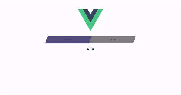
Finally, that’s all for everything. On your terminal, run this command: npm run serve. And if you’ve followed the code well, your final result should look like this.
I believe this tutorial has been helpful. Kindly give it an upvote and do leave comments for any contribution.
Thank you 🤗.
Upvote
Samuel Adewole
Creator of all things possible || Achiever || Community lover.

Related Articles